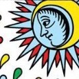
BradGad Posted March 7, 2023 Posted March 7, 2023 (edited) I’m enjoying getting to know the Talisman Tarot from TarotArts. The box describes the deck as a “Monoprint tarot inspired by Magic, Cartomancy, & the Tarot de Marseilles.” I am not crazy about tuck boxes (who is?), but this is one of the nicest, maybe the nicest, I have handled: sturdy, pretty, and wonderfully tactile. When I put the deck in my cart, it said I qualified for a free matching velvet bag. The images have a primitive (in the best sense), cave-drawing-like feel. I find this very appealing. What’s happening in the card doesn’t immediately present itself. You have to look at the card for a while and let the image emerge. For me, the effect of this is that studying and working with the cards is a more dynamic process than with clear, representational imagery. In the suits, the creator (Oli Starfrosting) used a cool, predominately blue palette for the “hard” or “active” suits, and a hotter, predominately red palette for the “soft” or “passive” suits. This struck me as backwards or at least counter-intuitive at first, but now that I have spent some time with the deck, it feels right. These palette choices somehow “calibrate” the deck, dialing up the energy for the low-energy suits and dialing it down for the high-energy suits. I think the courts are an especially strong aspect of the deck. With more traditional decks, we derive the energy of the card predominantly from the rank and suit. Here the imagery is also strongly comminicating a certain energy. Also, I’m finding it easier to bring out and ponder a shadow side to the court figures. For whatever reason, the orientation (i.e. whether the figure faces left or right) is reversed from the TdM standard for most but not all of the court cards: Page of Coins Queen of Coins King of Coins Knight of Swords Queen of Swords King of Swords Page of Wands Knight of Wands Page of Cups Knight of Cups Queen of Cups King of Cups I have yet to figure out if there is any system or layer of meaning to these choices on how to orient the figures. I’m sensing that a main value of this deck is that I will be able to apply what I know, what I have worked out, for TdM as a whole, but also be able to think about the imagery in a freer, more intuitive way. Hope so. Edited March 7, 2023 by BradGad
Misterei Posted March 10, 2023 Posted March 10, 2023 Interesting deck. It's compelling and original in a way that so many new decks are NOT. Thanks for sharing it. Much LOVE for Tarot Arts. Once they messed up my order and very kindly and quickly made it right. I've purchased a few of my fave decks from them.
Guest Posted March 11, 2023 Posted March 11, 2023 Very cool! With the primitive way the cards are done there’s almost a wild, primal thing going on there. I’m not even sure those would be the right words. It’s like it connects back to some very OOOLLLDDD ancestors.
Recommended Posts
Create an account or sign in to comment
You need to be a member in order to leave a comment
Create an account
Sign up for a new account in our community. It's easy!
Register a new accountSign in
Already have an account? Sign in here.
Sign In Now