Jump to content

Tarot Landscapes


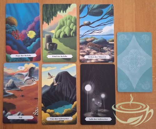
Tarot Landscapes (German title: Landschaften der Seele / Landscapes of the Soul Tarot)


Author – Francesca Matteoni
Artist – Yoshi Mari

US publisher – Vivida

First Published - 2023
ISBN-10
:  8854420395

ISBN-13 :  978-8854420397

Weight - 454 g
Card Size – 7x12 cm (German version), 4.56 x 6.25 inches (according to their US publisher)
Box Size – 8x13x4.5 cm
Language – English (I have the German version)

Purchase here -  https://artisantarot.com/products/tarot-landscapes?srsltid=AfmBOorWF7zOPIEaxfcxnwiQXkhfx2FBmpqe3lBs6oXMAZYcAUJjL9W6

From the album:

Animal and Nature Decks

· 29 images
  • 29 images

Photo Information


Nemia


This is a very special deck that appealed to me immediately. Who doesn’t love untouched nature? I certainly do, and I love landscape art as well.

In Art History, we use the term “pathetic fallacy” to describe the human tendency to project feelings onto inanimate objects or landscapes. If you have ever seen a Disney animated movie, you know how it works – it always rains when something sad is happening, storm clouds appear when there is danger ahead, and a sparkling spring day promises a happy new beginning. We immediately understand this language of nature, and it speaks to us.


The term “pathetic fallacy” has always bothered me because it’s a combination of two negatives. I’d replace it with “projective empathy” because it’s neither pathetic nor a fallacy. Understanding the moods and messages of nature has been just as important to the survival of our species as understanding those of the people around us.


TarotLandscapessixcards.jpg.eea3adeced4524ad8b34b4eebec3090e.jpg


Reading nature and projecting our own feelings back on nature is a silent communication, and it works even more powerfully for me than doing the same with human figures or animals. It’s a very pure feeling: looking at a landscape, sensing its message on a non-verbal, deep level. That’s why I’m very much attracted to decks like Majestic Earth Tarot, Flow Tarot, the Idiosyncradeck and Tyldwick Tarot (which does the same projective empathy with empty, evocative rooms).


Tarot Landscapes are wide, colourful, and painted in a soft style. They invite you. The horizons tend to be high: mostly in the upper third of the card, and hardly ever lower than in the middle of the card. Often, the spectator seems to be in a hidden spot, behind leaves or bushes, or on a rock, overlooking wide spaces.


There are traces of human activity: we see houses, toys, railway tracks and in the Emperor and Strength, high-rise buildings. However, it’s a quiet world where we don’t see busy humans and their interactions. We move through this world, watching and reacting to what we see.


For me, this deck works a bit like a walking meditation, my favourite kind of meditation – your soul goes quiet when you let the beauty and power of nature enter it.

When I looked at it for the first time, I had a strong sense of deja vu with many cards. I felt as though I had seen these images before, in my dreams or some half-forgotten memory. These cards are very evocative, and the lack of detail means that you’re invited to fill them with your own inner images.


TarotLandscapesCupscourt.jpg.1a1bd68f819644313ee7b00e180cf383.jpg


Animals appear in many cards, and sometimes I feel they’re not even necessary. Since animals have strong symbolic associations, they may even interfere with the quiet appreciation of nature. In the court cards, animals feel very apt because they focus our attention on character and interaction, but in many other cards, I could have done without them. They do give charm to the scenes and emphasise the mood, but the cards without any animated presence work just as well, if not even better.


Borderless cards make reading easy for me – the moment two cards are laid out next to each other, they start to interact, and you can move from one landscape, one mood, into the next. There is a natural flow to borderless cards that makes them accessible. This deck fits perfectly with the narrative, associative reading style that I prefer.


The backings are simple and reversible, in two nuances of blue-green with stylised tree designs in a geometrical pattern. The cardstock is thick with a satin finish; the cards feel solid and a bit on the stiff side but flexible. Right now, they stick a bit to each other when shuffling, but I’m sure that over time, this stickiness will disappear and they’ll behave beautifully.

The box is sturdy, easy to open and beautiful. My German version shows the Empress landscape on the box, warm and inviting.


The little book is nicely done, with colour illustrations and short, descriptive texts. I’m not a huge fan of the positive and negative keywords given, but if you know the tarot, you don’t need them. Actually, this deck works great on its own. By simply looking at the cards, you can get strong messages.


I have added a picture for comparison with similarly themed decks.


DeathComparison.jpg.b31e96ef58f46ef9c54ad91bcf7b6f07.jpg


The Flow Tarot and the Majestic Earth Tarot are borderless as well. Each of them interprets the tarot archetypes in the natural world differently, in this case, the Death card. Tarot Landscapes depicts the threat to life that we have to live with, the Flow Tarot focuses on the chance of transformation, and the Majestic Earth Tarot shows the challenge of loneliness and desolation. 


If you love landscapes and this simple, unfussy art style, I recommend Tarot Landscapes. It’s probably not a beginner’s deck; you have to know the tarot archetypes and work freely with this deck. Looking up the meanings in a generic book won’t give you much to work with. However, using your visual, non-verbal communication skills, you’ll get a lot from this deck, and it can help you to read other decks in this open style as well.


×
×
  • Create New...

Important Information

We have placed cookies on your device to help make this website better. You can adjust your cookie settings, otherwise we'll assume you're okay to continue.