-
Deck Reviews
Only decks in the Deck Library that have at least one review are listed in this section
-
Albums
-
Artistic Decks
- By DanielJUK,
- 0
- 44
-
Feminine Decks
- By DanielJUK,
- 0
- 1
-

Animal and Nature Decks
- By DanielJUK,
- 0
- 29
-
Historical Decks
- By DanielJUK,
- 0
- 9
-
Modern Decks
- By DanielJUK,
- 0
- 7
-
-
Image Reviews
-
By Pierre-Yves
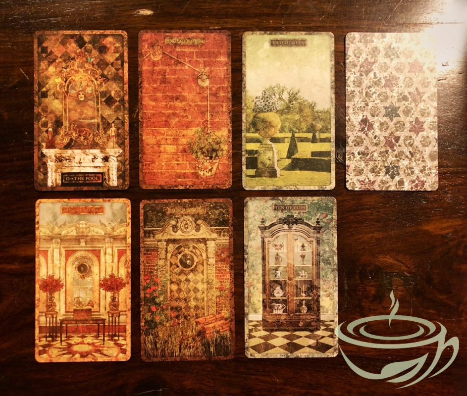
The Tyldwick tarot deck is unique. Each card represents a part of an old English manor house. As you go through the deck, you discover the rooms, outbuildings and gardens of this manor house. The cards contain many clues as to their meaning. The major arcana are full of decorative elements that are symbols to be deciphered. While the structure of the deck is that of the Rider-Waite-Smith tarot, the language used is completely original.
The box is sturdy and the cards are of excellent quality. The gilding on the side of the deck is discreet and fits in well with the design. This tarot deck is beautiful. However, good lighting is necessary to appreciate it. The matte finish of the cards helps to see the details, but the manor house imagined by Neil Lovell is dark and dusty. The very pronounced textures sometimes make the scenes abstract, and one can see images that are not there (as when looking at clouds). Readability is therefore not this tarot deck's strong point. It requires effort to understand and interpret. You have to like puzzles.
The booklet that accompanies the 10th anniversary edition of the Tyldwick tarot deck is unreadable. I didn't know it was possible to print such small characters. I managed to read it using a magnifying glass, but it wasn't pleasant. I finally found an old version of the booklet online, in PDF format.
The beauty of the Tyldwick tarot is fascinating. As we browse through these cards, the absence of characters prompts us to wonder who lived there, who still lives there. The shadows and mystery sharpen our sense of observation. From then on, we believe we can sense a presence. The places appear haunted. And the Tyldwick tarot becomes completely magical.
-
By Nemia
This is a very special deck that appealed to me immediately. Who doesn’t love untouched nature? I certainly do, and I love landscape art as well.
In Art History, we use the term “pathetic fallacy” to describe the human tendency to project feelings onto inanimate objects or landscapes. If you have ever seen a Disney animated movie, you know how it works – it always rains when something sad is happening, storm clouds appear when there is danger ahead, and a sparkling spring day promises a happy new beginning. We immediately understand this language of nature, and it speaks to us.
The term “pathetic fallacy” has always bothered me because it’s a combination of two negatives. I’d replace it with “projective empathy” because it’s neither pathetic nor a fallacy. Understanding the moods and messages of nature has been just as important to the survival of our species as understanding those of the people around us.
Reading nature and projecting our own feelings back on nature is a silent communication, and it works even more powerfully for me than doing the same with human figures or animals. It’s a very pure feeling: looking at a landscape, sensing its message on a non-verbal, deep level. That’s why I’m very much attracted to decks like Majestic Earth Tarot, Flow Tarot, the Idiosyncradeck and Tyldwick Tarot (which does the same projective empathy with empty, evocative rooms).
Tarot Landscapes are wide, colourful, and painted in a soft style. They invite you. The horizons tend to be high: mostly in the upper third of the card, and hardly ever lower than in the middle of the card. Often, the spectator seems to be in a hidden spot, behind leaves or bushes, or on a rock, overlooking wide spaces.
There are traces of human activity: we see houses, toys, railway tracks and in the Emperor and Strength, high-rise buildings. However, it’s a quiet world where we don’t see busy humans and their interactions. We move through this world, watching and reacting to what we see.
For me, this deck works a bit like a walking meditation, my favourite kind of meditation – your soul goes quiet when you let the beauty and power of nature enter it.
When I looked at it for the first time, I had a strong sense of deja vu with many cards. I felt as though I had seen these images before, in my dreams or some half-forgotten memory. These cards are very evocative, and the lack of detail means that you’re invited to fill them with your own inner images.
Animals appear in many cards, and sometimes I feel they’re not even necessary. Since animals have strong symbolic associations, they may even interfere with the quiet appreciation of nature. In the court cards, animals feel very apt because they focus our attention on character and interaction, but in many other cards, I could have done without them. They do give charm to the scenes and emphasise the mood, but the cards without any animated presence work just as well, if not even better.
Borderless cards make reading easy for me – the moment two cards are laid out next to each other, they start to interact, and you can move from one landscape, one mood, into the next. There is a natural flow to borderless cards that makes them accessible. This deck fits perfectly with the narrative, associative reading style that I prefer.
The backings are simple and reversible, in two nuances of blue-green with stylised tree designs in a geometrical pattern. The cardstock is thick with a satin finish; the cards feel solid and a bit on the stiff side but flexible. Right now, they stick a bit to each other when shuffling, but I’m sure that over time, this stickiness will disappear and they’ll behave beautifully.
The box is sturdy, easy to open and beautiful. My German version shows the Empress landscape on the box, warm and inviting.
The little book is nicely done, with colour illustrations and short, descriptive texts. I’m not a huge fan of the positive and negative keywords given, but if you know the tarot, you don’t need them. Actually, this deck works great on its own. By simply looking at the cards, you can get strong messages.
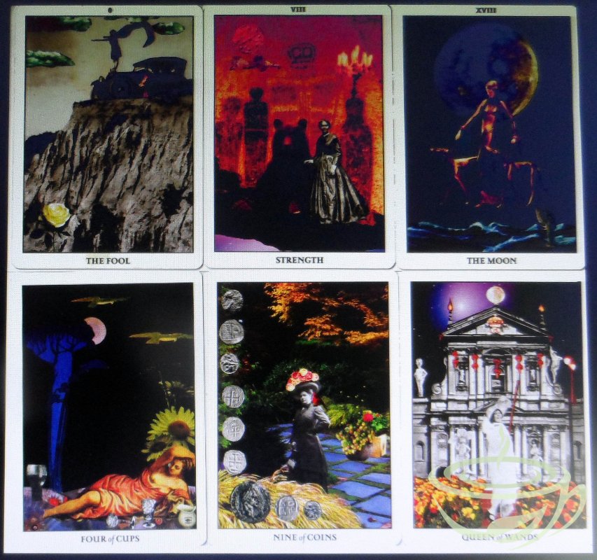
I have added a picture for comparison with similarly themed decks.
The Flow Tarot and the Majestic Earth Tarot are borderless as well. Each of them interprets the tarot archetypes in the natural world differently, in this case, the Death card. Tarot Landscapes depicts the threat to life that we have to live with, the Flow Tarot focuses on the chance of transformation, and the Majestic Earth Tarot shows the challenge of loneliness and desolation.
If you love landscapes and this simple, unfussy art style, I recommend Tarot Landscapes. It’s probably not a beginner’s deck; you have to know the tarot archetypes and work freely with this deck. Looking up the meanings in a generic book won’t give you much to work with. However, using your visual, non-verbal communication skills, you’ll get a lot from this deck, and it can help you to read other decks in this open style as well.
-
By Chariot
This Allcento Tarot captivated me instantly. This surprised me, as it's a ‘cartoon-y’ deck—which I usually don’t go for. I’m not a deck collector either, but only buy decks I intend to use for readings. So instant love surprised me a bit, while I watched a YouTube flip-through of this deck.
The Allcento Tarot has so much going for it. The images are colourful, yet distinct, labeled clearly, and can be easily recognised during a reading, even in relatively dim light. The images are cartoon-like (drawn by the author of the deck, Michael Auger) but contain perfectly recognisable RiderWaiteSmith images. In most cases, the Auger-drawn images manage to add to—or clarify—the meanings of standard RWS cards. This means The Allcento Tarot doesn’t operate as a mere clone, but is a very intelligent deck in its own right.
So much to like. For one thing, each suit in the Minor Arcana has its own particular colour (as illustrated above.) So when looking at a complicated reading, it’s easy to see instantly which suits are prominent in the reading, etc. The Major Arcana cards all have a purple tint to them. This colour-coding is a very effective trick, enabling easy visual recognition during a reading.
Another plus for me is how easy the cards are to handle and shuffle. They are not as narrow as some tarot cards, but certainly easy to handle for me, and I have relatively small hands. The card stock seems durable, but the cards are thin and flexible enough enough to riffle-shuffle. They are also smooth enough to deal out without clumping or sticking together. The edging is black, if that matters. I don’t particularly care for edging myself, but this edging certainly doesn’t detract.
The overall impact of the cards is lighthearted, which might not suit every situation. However, if you want an occasional break from a serious sort of tarot, this would be an excellent option. I did my first reading with this deck last night, and got an accurate reading regarding a not-too-weighty question. Whether this deck will work in weightier situations, only time will tell.
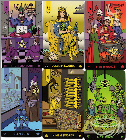
Many of the cards are quite amusing …notice the Queen of Swords here. She means business! She’s just sliced off somebody’s head! Don’t mess with this Queen.
The Hierophant also made me smile. He’s obviously some guru-ish fellow, filled with self-importance regarding his role in the world. Here he is dispensing not so much innate wisdom as a list of Do’s and Dont’s. The two young people listening to him are being respectful, but they aren’t groveling, either.
The 5 of Wands illustrates the concept of too many cooks spoiling the soup—an aspect of the 5 of Wands I’ve always subscribed to. (The Committee Card!)
The 9 of Swords literally depicts the Monkey Mind at work, disturbing the person’s sleep and causing worry and agitation.
The 6 of Disks depicts a King and wealthy lady dispensing food and drink to needy subjects (including a begging dog!)
One of my favourite cards in this deck is the 6 of Cups. It clearly depicts a person looking through a filmy window onto his personal past. It’s clear that these children don’t exist in the present day, but are as this elderly man remembers them during his childhood or his past in general. It’s definitely a ‘nostalgia’ or ‘memories’ card.
While this deck does include some degree of racial diversity (a few non-caucasian faces), and quite a lot of gender diversity, neither of these concepts are ‘in your face.’ This might not suit people who want emphatic racial or gender-diverse decks. But as these images are so RWS-based, I think the artist has done a good job with this aspect of the cards.
There are a few Major Arcana cards that have been re-named …The Choice instead of The Lovers; Time instead of The Hermit; Fortitude instead of Strength; The Thunderbolt instead of The Tower; Fame instead of Judgement; and The World Soul instead of The World. Whether these changes help or hinder the readings is up to the individual. Personally, I just ignore the changes and read as if the cards were named like the normal RWS cards, as the images are actually the same—more or less.
What I have ignored in this review is the fact that the author has added 22 MORE cards to the deck, giving us a total of 100 cards. I haven’t attempted to use these extra cards yet. Not sure if they will enhance the experience or not. I also found myself slightly put off by the comprehensive book included with the deck. It’s very comprehensive and illustrated as well, but I thought it would be straightforwardly written because the cards are straightforwardly illlustrated. Instead, I found it slightly vague in tone and not much overall help in understanding Mr Auger’s intentions for each card. This vagueness especially impacts the extra cards, which is one of the reasons I’ve not really looked at them much. However, if you already have a good grounding in the RWS system, you will be able to dive in without the book, and use the usual 78 cards with no bother at all.
I love this deck. Despite a few peripheral flaws as noted above (in my opinion), I highly recommend it to RWS system readers. Maybe not as a first deck, due to the vague tone of the book’s explanation of card meanings. But if you’re already ‘there’ with RWS, you will probably enjoy using the Allcento Tarot whenever you’re in a lighthearted mood.
-
By Pierre-Yves
I was thrilled by the beauty and quality of this tarot deck designed by American illustrator Lee White. The deck is prettier than what I'd seen online. And I was pleasantly surprised by the plastic-free packaging.
Presented in a magnetic-lid box, the cards are large and sturdy. Each major arcana has been reinvented to tell a story. The tender, playful scenes evoke the wonder of childhood. On the project page, Lee White explains that he wanted to create images that would make you slow down and dive into them with a smile on your face. That's exactly what his illustrations did for me! These images with their lost edges make you want to lose yourself in their contemplation, perhaps to better find your way around.
-
By gregory
This is a rather special collage deck - something of a family project in a way; the creator did the collage art by hand - cutting out old photos, magazines, postcards anything that worked - scanned her collages and then asked her niece (named in the credits as Octavia) to format them to the right size and add the borders and font wanted. Johanna did the collage art for the box and booklet, and again Octavia formatted them to fit the box template. As Johanna says, “Basically, she did the computer work for me. I made all the choices, but just don’t know how to use tech stuff.” A very successful partnership.
The cards are large - 3 inches by 5 - and silver edged, and, unusually, the silver isn’t flaking off (yet, anyway). They are on heavy stock - very durable but they won’t riffle shuffle - and wonderfully smooth.
The cards themselves are full of detail and symbols, reinforcing Waite/Smith themes, and adding several more layers; each comes across differently every time it is drawn in a reading. I have always loved collage decks, and this one is a gem; I feel that collage has a special way of adding layers to meanings - almost literally - and this one does it in spades. The colour is rich and engaging, and I find myself looking through the cards over and over, just to look, never mind reading. The three lovers cards between them cover all orientations, and the deck is also - how does one say this these days - “fully inclusive”, not that I went through looking for different races etc. It even starts with a female fool. I’m not sure why she wanted two death cards, but I can’t argue with it as my own deck does the same and hers are great.
The booklet, too, is better than most; it is clearly written by someone who knows her tarot and who put a great deal of thought into the cards she created. This is perhaps the first deck I have seen in a while made with quite such careful thought. Definitely a keeper.
-